Vaadin Design System
Components, themes, design assets and tooling for building consistent UIs
Design. Develop. Extend.
What's inside
Vaadin Design System consists of modern UI components with customizable styling, comprehensive documentation, UI design assets, and the tooling you need to build a solid foundation for your applications.
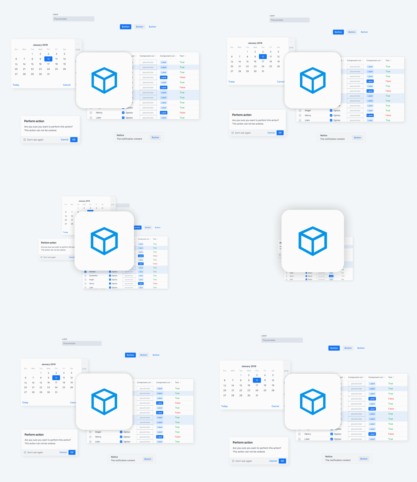
40+ polished UI components
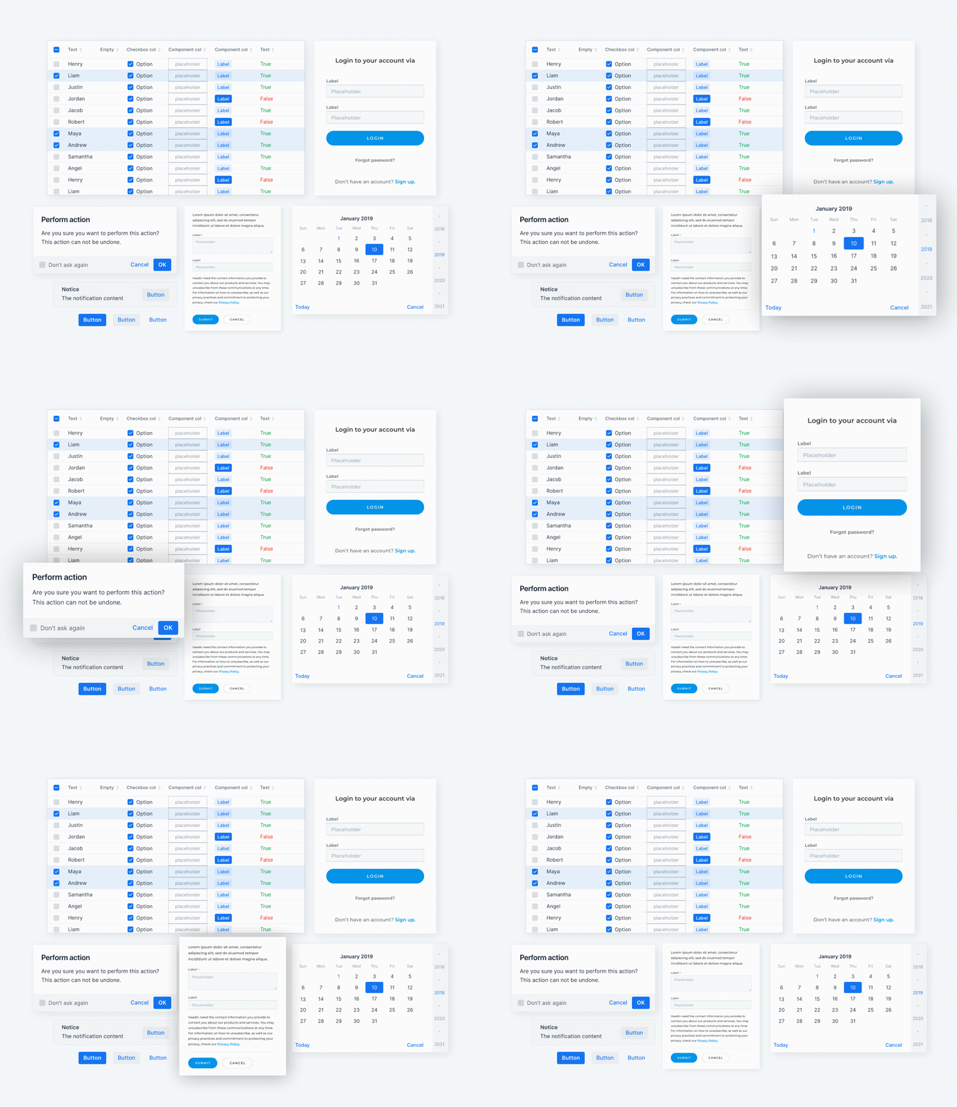
Vaadin components are designed to be intuitive, responsive and adaptable for any type of business application. Each component is based on the Web Components standard, and natively supported by all modern browsers. They are framework agnostic, but optimized for use with Vaadin Java backends.
Two customizable themes
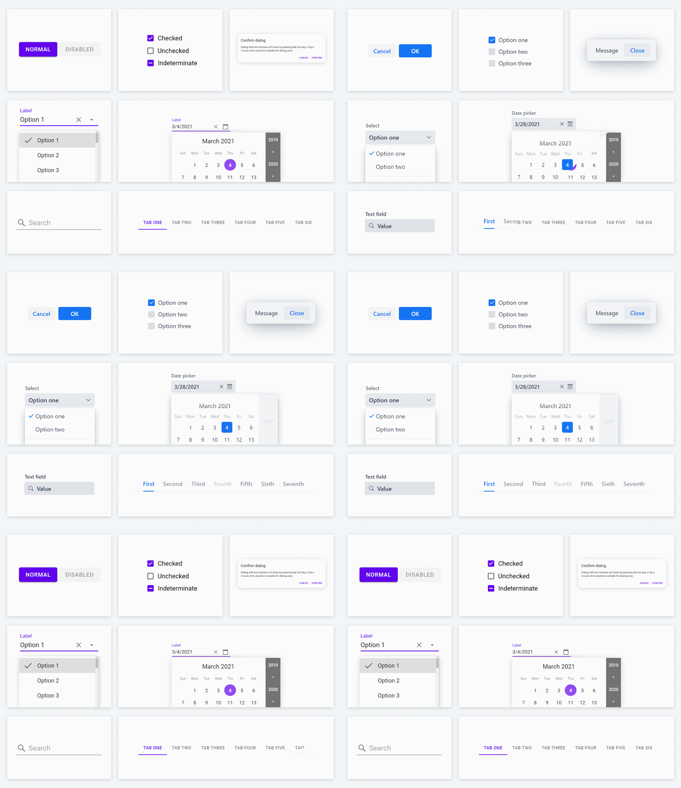
Vaadin’s Lumo and Material themes provide foundational styles – typography, colors, sizing, spacing and icons – that provide a modern look and feel for Vaadin components. They are easily customizable without css expertise thanks to parameterized styles and excellent documentation.
Figma library
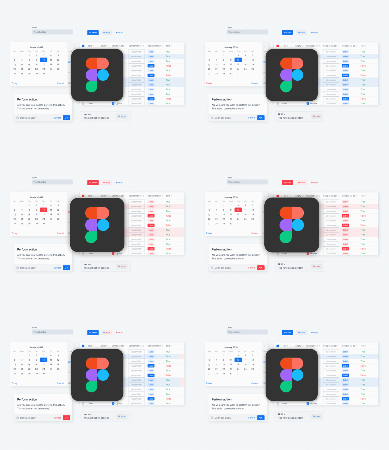
Designers can use the Vaadin Figma Library to create pixel perfect UI designs and prototypes that can be handed over to developers with ease. The kit contains graphical representations of all Vaadin components with the default Lumo styling that can be easily adapted to suit your branding and vision.
Interactive component documentation
At the heart of Vaadin’s design system are comprehensive technical documentation and usage guidelines for components and theme features to help you achieve an excellent user experience in any application.
Custom Design Systems
Components and themes can be easily packaged into a single design system dependency for reuse in multiple applications. This feature works with Vaadin Flow and Fusion frameworks.
Design System Publisher
An CLI-based tool that provides a simple way to document Vaadin-based custom design systems, including code samples and interactive demos for components. Simply author your content using an intuitive, AsciiDoc-based syntax, and the tool will generate a hostable documentation website to help your designers and developers find the information they need to build great applications.
For developers
Developers can use Vaadin components and themes to easily implement consistent, responsive and user-friendly UIs. Customizable styling and a design system packaging format make it easy to build a reusable UI foundation for the entire organization.
For designers
Designers can design and prototype UIs in Figma, using pixel-perfect graphical representations of all Vaadin UI components, foundational visual styles provided by the Lumo theme, and aided by clear design guidelines optimized for Vaadin-based applications
For teams
Streamline UI design and development and improve UI consistency by building a custom design system. Bundle components and themes as a reusable package, and create a documentation website for your UI features using the Publisher tool.
For end users
End users get a consistent user experience, and familiar UI patterns throughout an application, allowing for intuitive use and heightened productivity with minimal onboarding requirements.